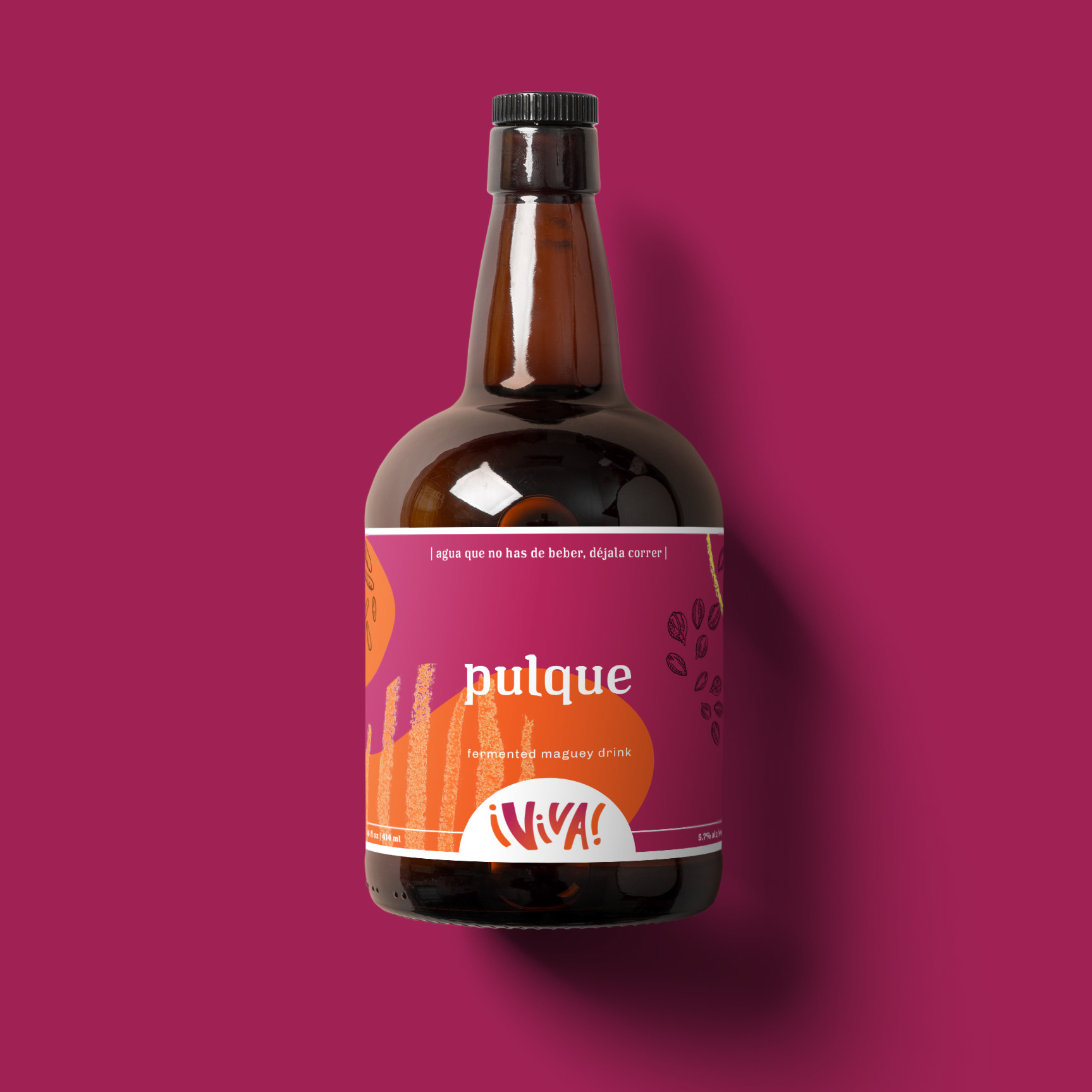
¡viva!
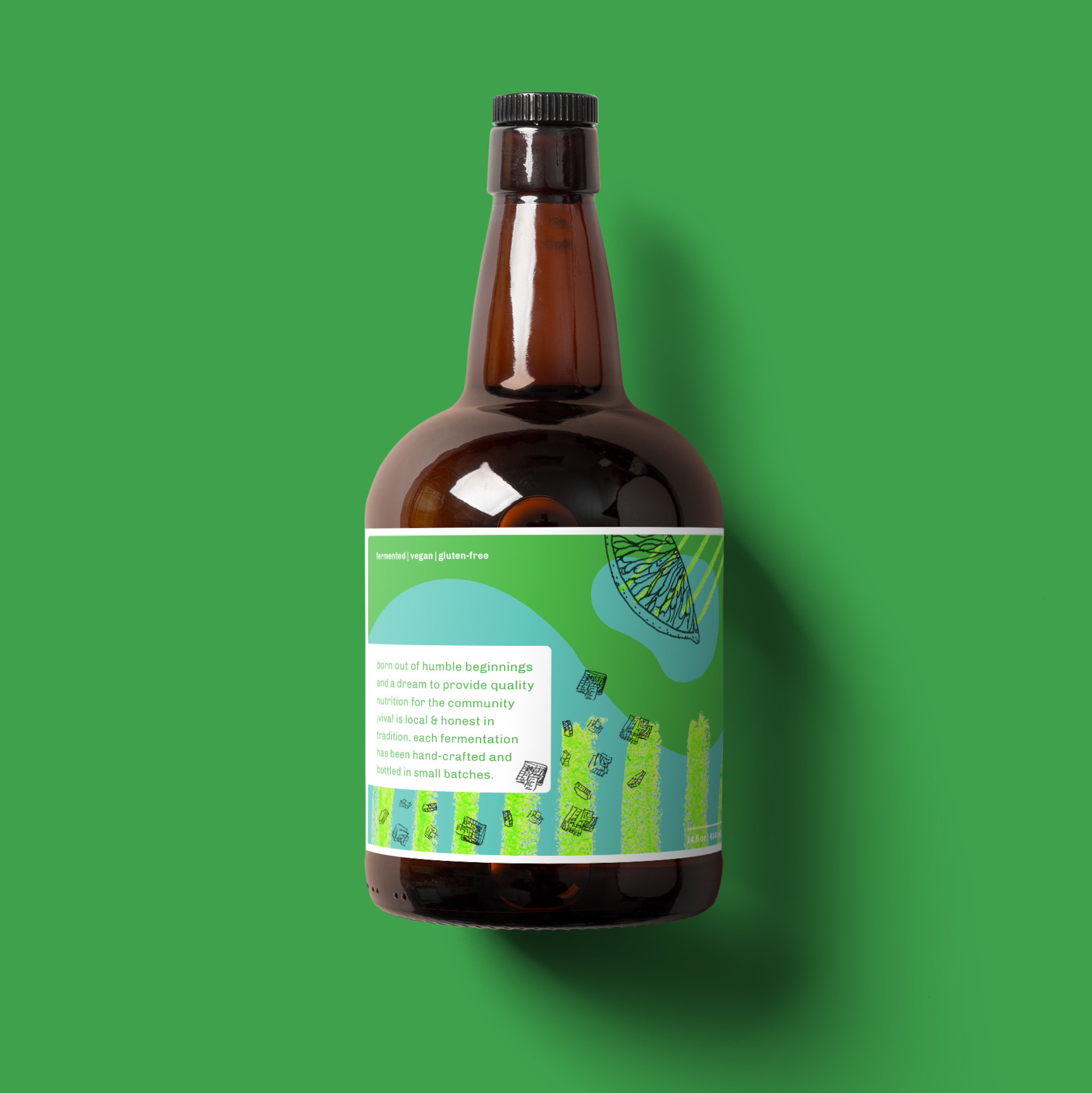
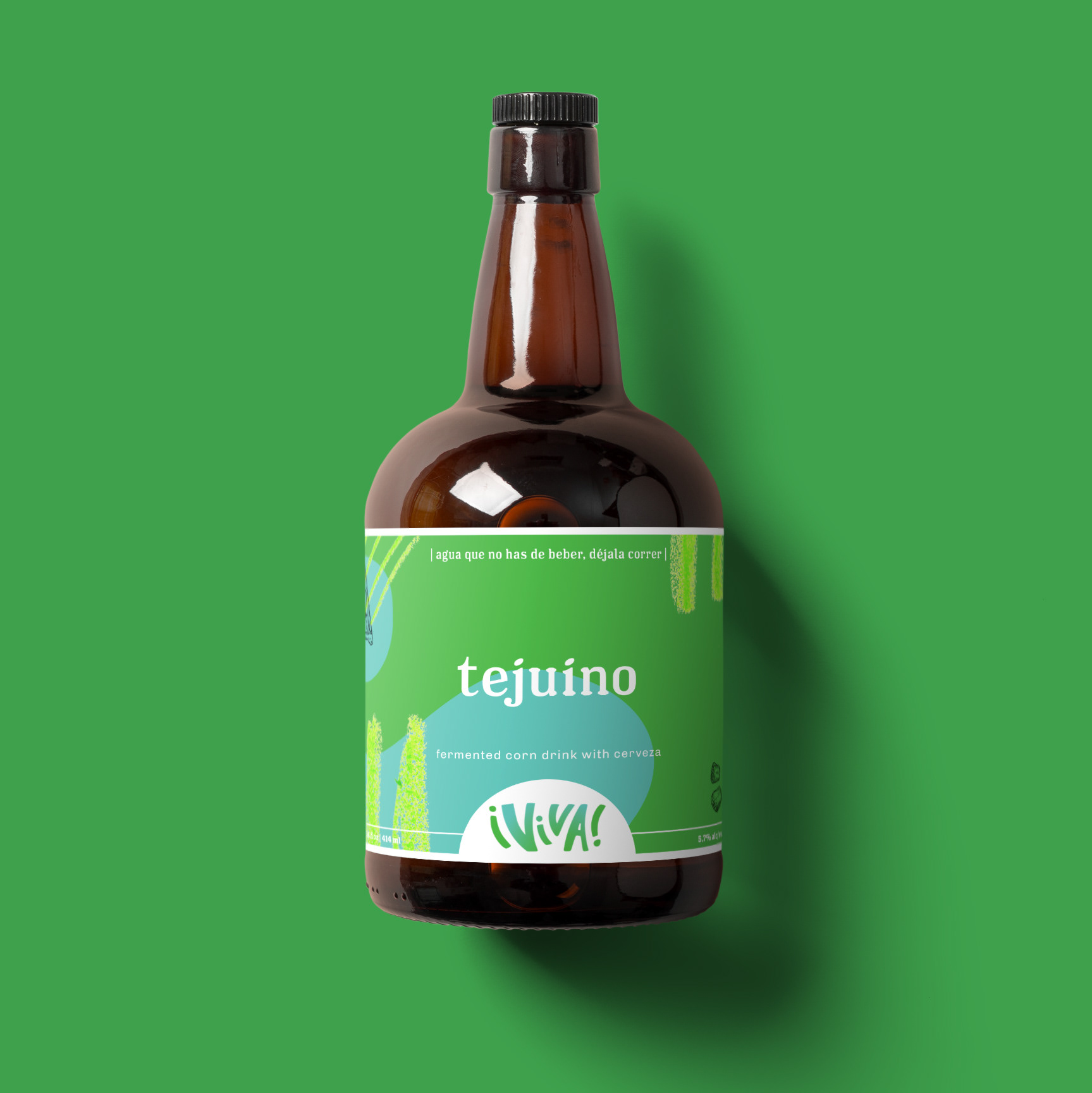
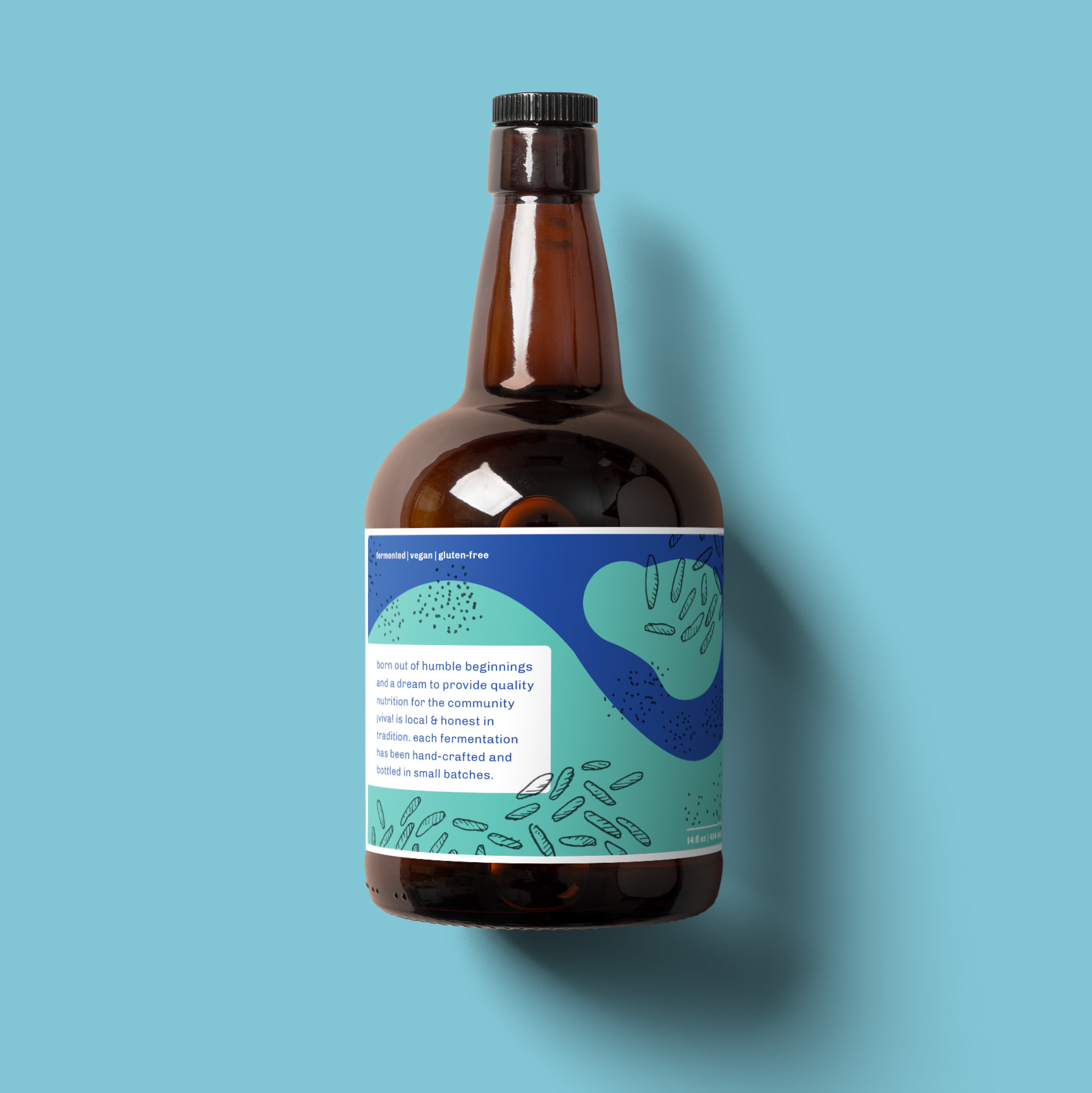
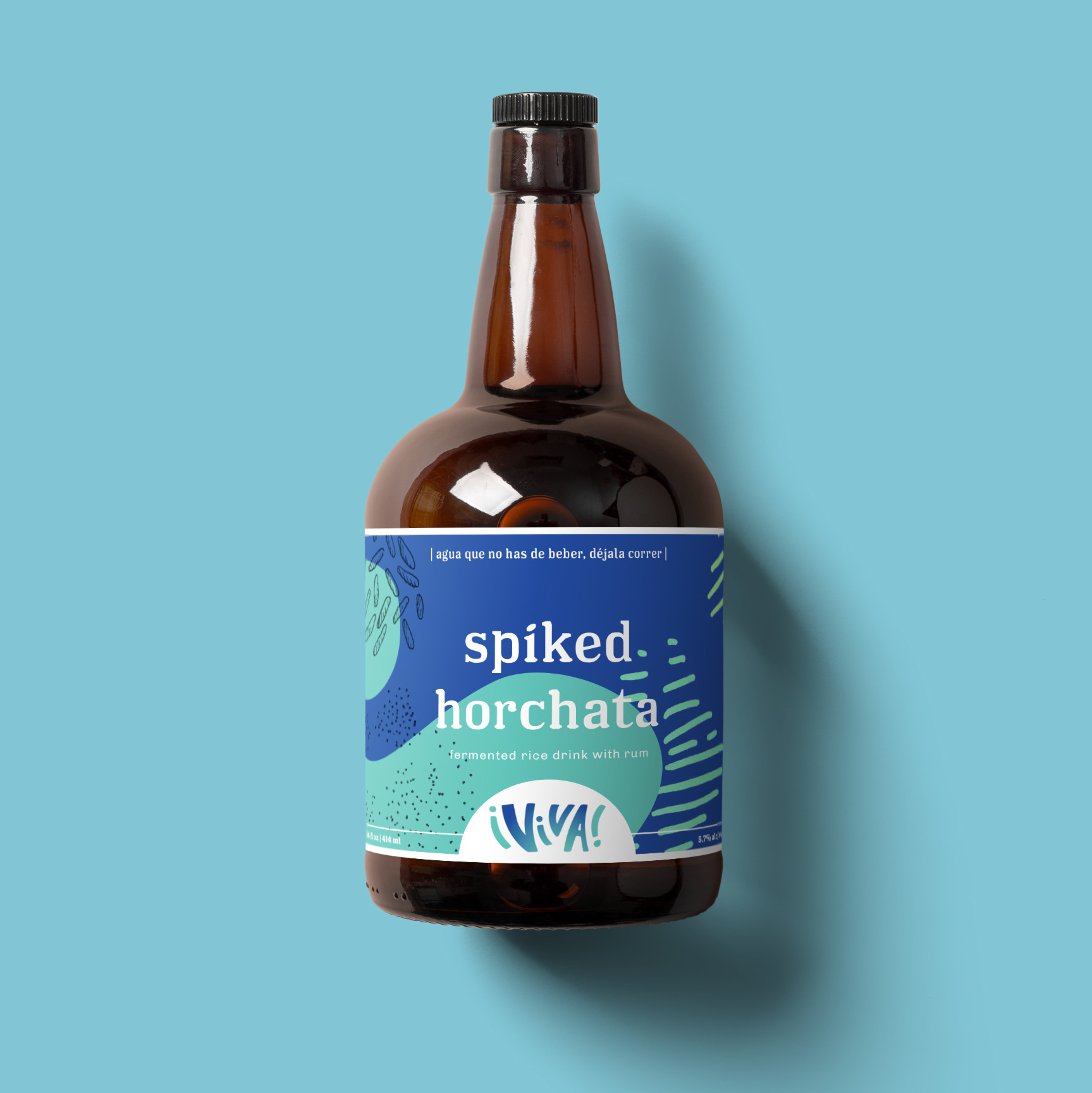
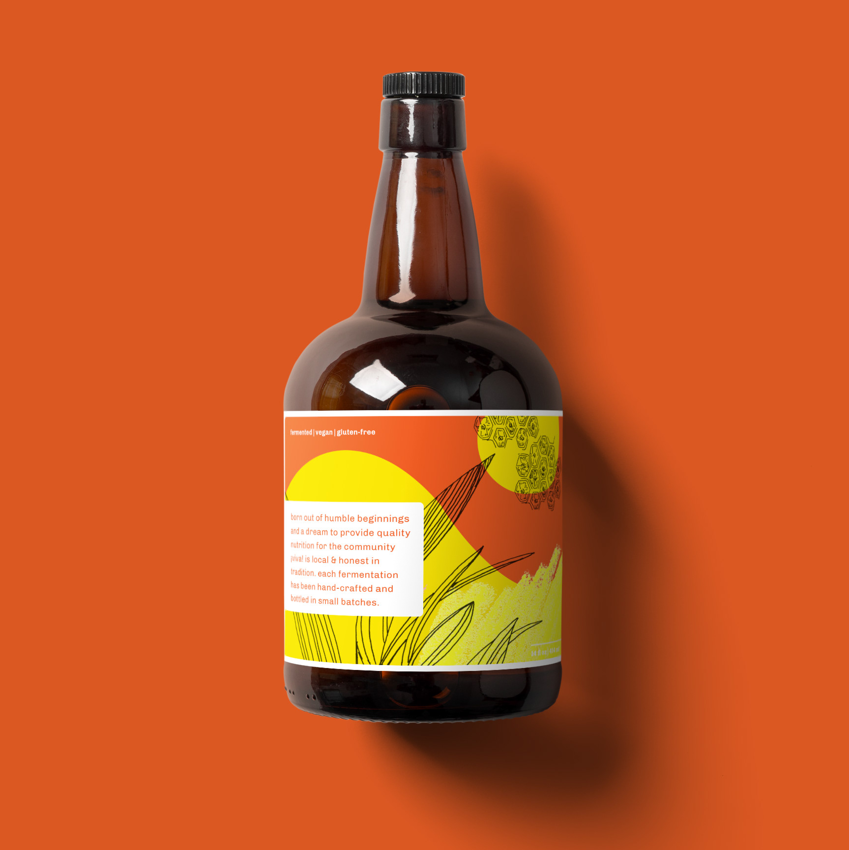
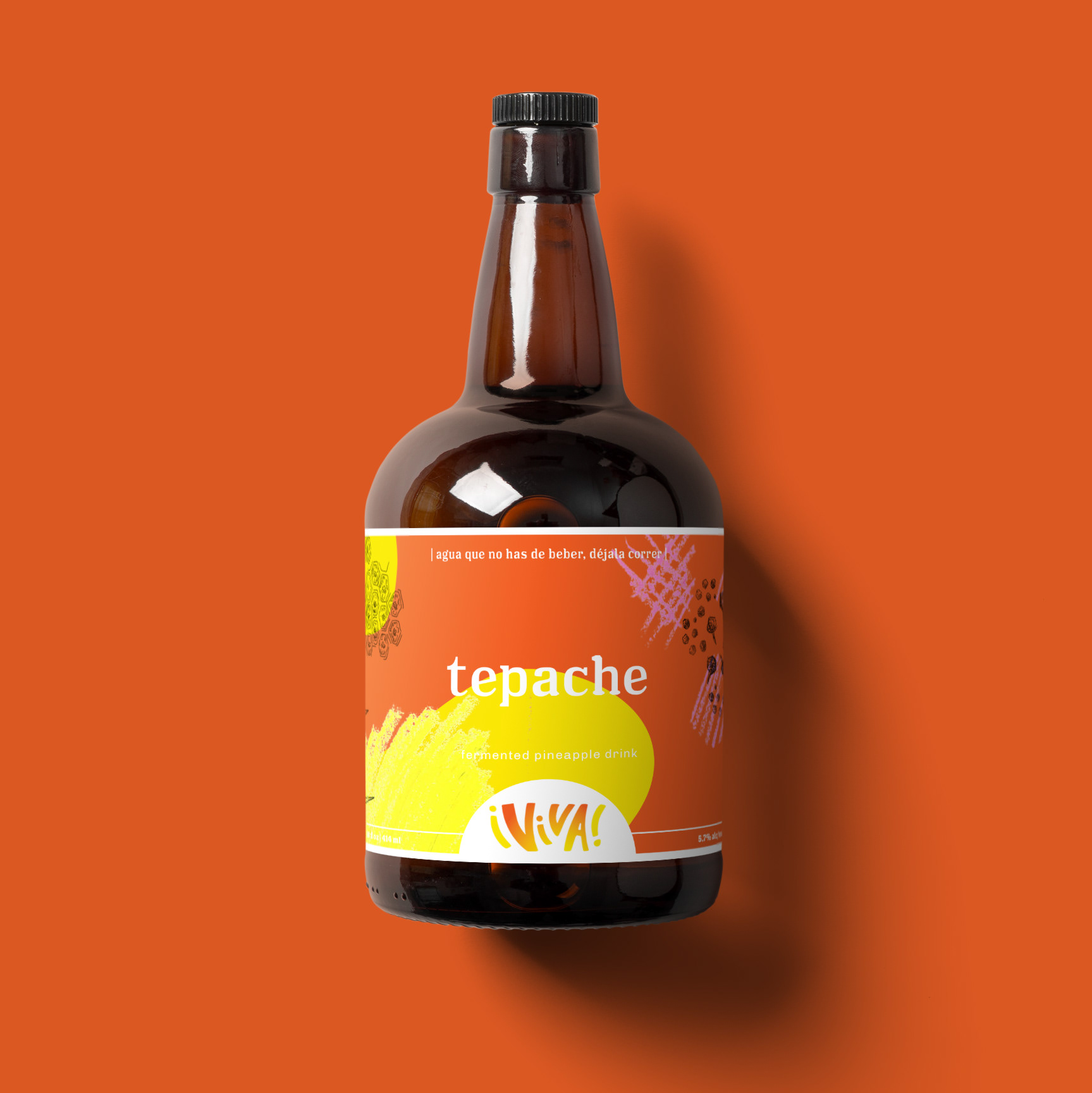
This conceptual bottled beverage company has a focus on fermentation and being authentic in both origin and flavor. The logo was developed with a hand-lettered sensibility, in reference to the typographic murals seen throughout Mexico City.

The one color logo yields high readability on both digital and print applications.
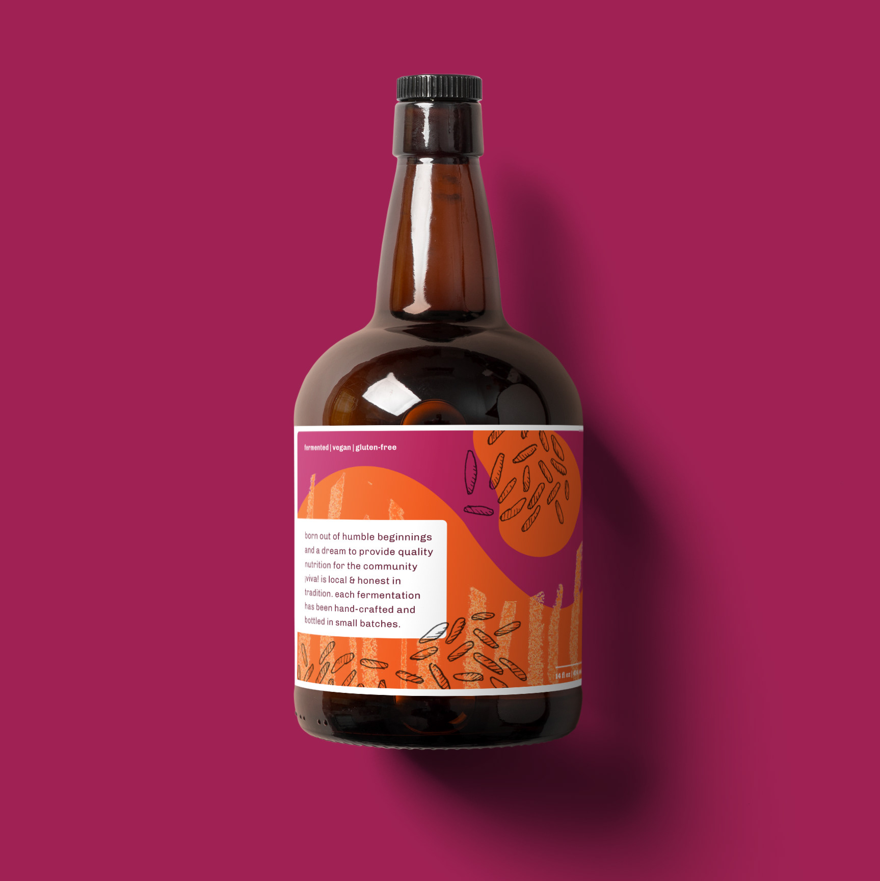
Creating a colorful and dynamic logo was important in keeping the packaging recognizable to the consumer. The variable colors in the logo match with each individual bottle's color palette to help differentiate the bottles from each other since the flavors are so distinct.


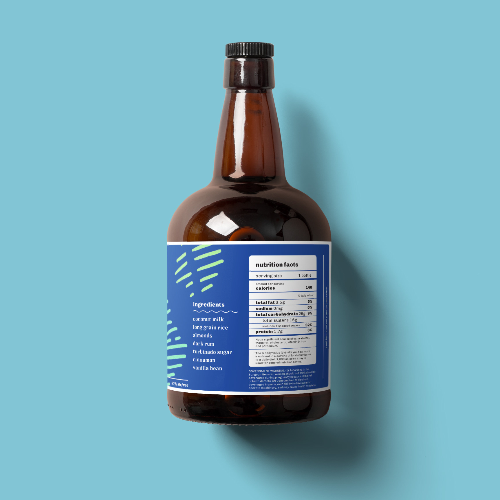
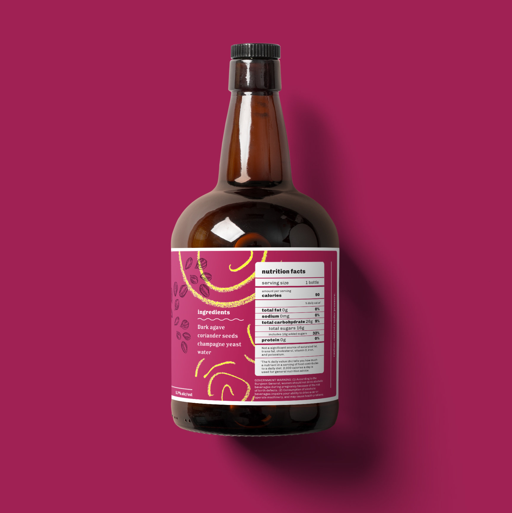
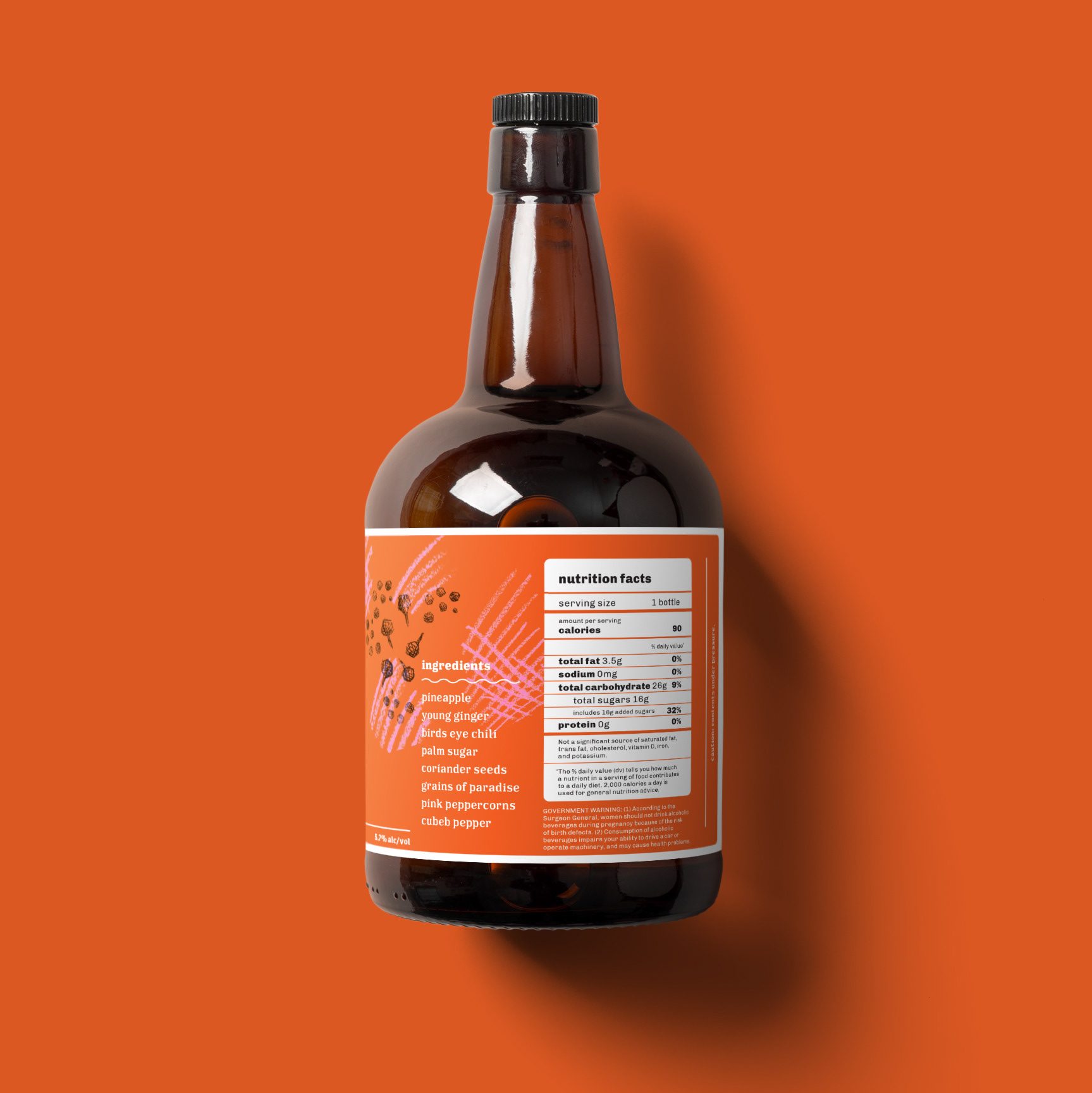
The packaging emphasizes the name of the product, making it clear what the contents are, even if the consumer might be unaware of what the product is. In addition, for fermented beverages, it's important to have a dark-glass component to keep the delicate flavors protected from harsh sunlight.